A security platform that wants to change what a gateway is
The company describes its ambition plainly: not just another Secure Web Gateway, but a new standard for what one should be.
It works at Layer 7, not on ports and IP addresses.
VxSure judges each web transaction by who is acting, which application they use and what data is moving, including inside encrypted HTTPS traffic.
It is built with the people who deploy security.
Its first audience is architects, engineers, System Integrators, MSSPs and consultants, invited through a Founding Partner Beta to shape the product.
What the mark had to say
I turned the product story into four shifts: what the logo had to move away from, and what it had to say instead.
PadlockGateway
VxSure works at Layer 7, where business traffic happens. The mark shows a point traffic passes through, not a locked door.
One providerAny cloud
It runs on public cloud, private cloud and hypervisors, so the symbol reads as cloud without naming a vendor.
WallEnabler
The promise is secure productivity: people keep working while data stays protected.
Legacy vendorNew standard
VxSure is launching through a Founding Partner Beta. The mark had to feel new and confident.
A cloud, a perimeter and one way through
Instead of a padlock or a shield, the symbol shows the gateway itself: a protected cloud with a single inspected entrance.
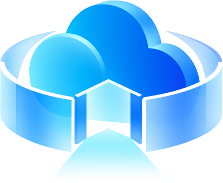
Cloud
Where VxSure runs: public cloud, private cloud and virtualised datacentres.
Ring
The boundary VxSure governs, wrapped around users, applications and data.
Gateway
One opening with an arrow. Traffic enters through a single inspected point.
Light path
Traffic continues on the other side. The gateway shapes access rather than stopping it.
Three calls that decided the mark
- Decision 01
A gateway, not a padlock or a shield
- The question
- What should a Layer 7 gateway’s mark show?
- Options I weighed
- Why this one
- VxSure’s promise is secure productivity: inspecting traffic at Layer 7 while people keep working. A single, inspected way through says that; a lock or a shield says the opposite.
- Trade-off I accepted
- It reads less instantly as “security” than a lock, so the wordmark and the product context carry that part.
- Decision 02
Only “Vx” takes the colour
- The question
- How should the wordmark relate to the symbol?
- Options I weighed
- Why this one
- The coloured “Vx” becomes the bridge between symbol and name, and “Sure” stays a word with its own meaning: certainty.
- Trade-off I accepted
- Two tones in one word need care on dark surfaces, which is why the reverse lockup has its own blue.
- Decision 03
A lighter blue for dark surfaces, not an inverted logo
- The question
- How does the lockup hold up on navy?
- Options I weighed
- Why this one
- A logo is judged on its worst background. Defining the reverse version up front means nobody improvises one later.
- Trade-off I accepted
- The palette carries two wordmark blues, and the usage guide has to say which goes where.
One mark in three versions
Each version uses the same symbol and colours, prepared for a different surface or size.
Primary Lockup
Symbol and wordmark for light surfaces. Only “Vx” is coloured, which ties the name to the symbol and lets “Sure” read as a plain word.
Reverse Lockup
For dark surfaces, “Vx” moves from #016AF3 to the lighter #34A6FE and “Sure” turns white, so both keep their contrast.
Standalone Symbol
The mark without the name, for small spaces. The scale test below shows where the gloss starts to fade.
96px64px32px16pxOne blue family, from deep to light
Values sampled from the logo files: the symbol's gradient and the two blues used in the wordmark.
Wordmark blue
#016AF3
RGB 1, 106, 243
Reverse blue
#34A6FE
RGB 52, 166, 254
Symbol deep
#147CFA
RGB 20, 124, 250
Symbol cyan
#2AC5FD
RGB 42, 197, 253
Symbol light
#9FD7FE
RGB 159, 215, 254
Testing the mark where people will see it
Illustrative mockups to check the mark at real sizes. They are not production screens.
VxSure ConsoleAdopted as VxSure's official mark
The company selected the logo and is using it for VxSure.
Key Learnings
AI sped up the execution, not the idea
The design work was deciding what the mark should say and choosing the route. The AI tools produced the vectors from that direction.
A glossy mark needs a flat partner
The scale test shows the detail fading by 16px. Favicons, small UI and one-colour print need a simplified version, which is the next piece of work.
Production files are part of the logo
Each source SVG is about 2 MB with roughly 1,000 paths. A hand-rebuilt master and a usage guide for clear space and minimum size come next.
SWG Threat Audit
Making secure gateway threat testing visible.