Six tabs, raw tables and no way to act on what you saw
I started with an audit of the live portal. It had grown around separate utilities: Manage Key, Categories, Certificates, VPN, Signatures and Account. Customers could see their data, but finding, monitoring and managing their systems took disconnected steps. One screen holds most of the story.
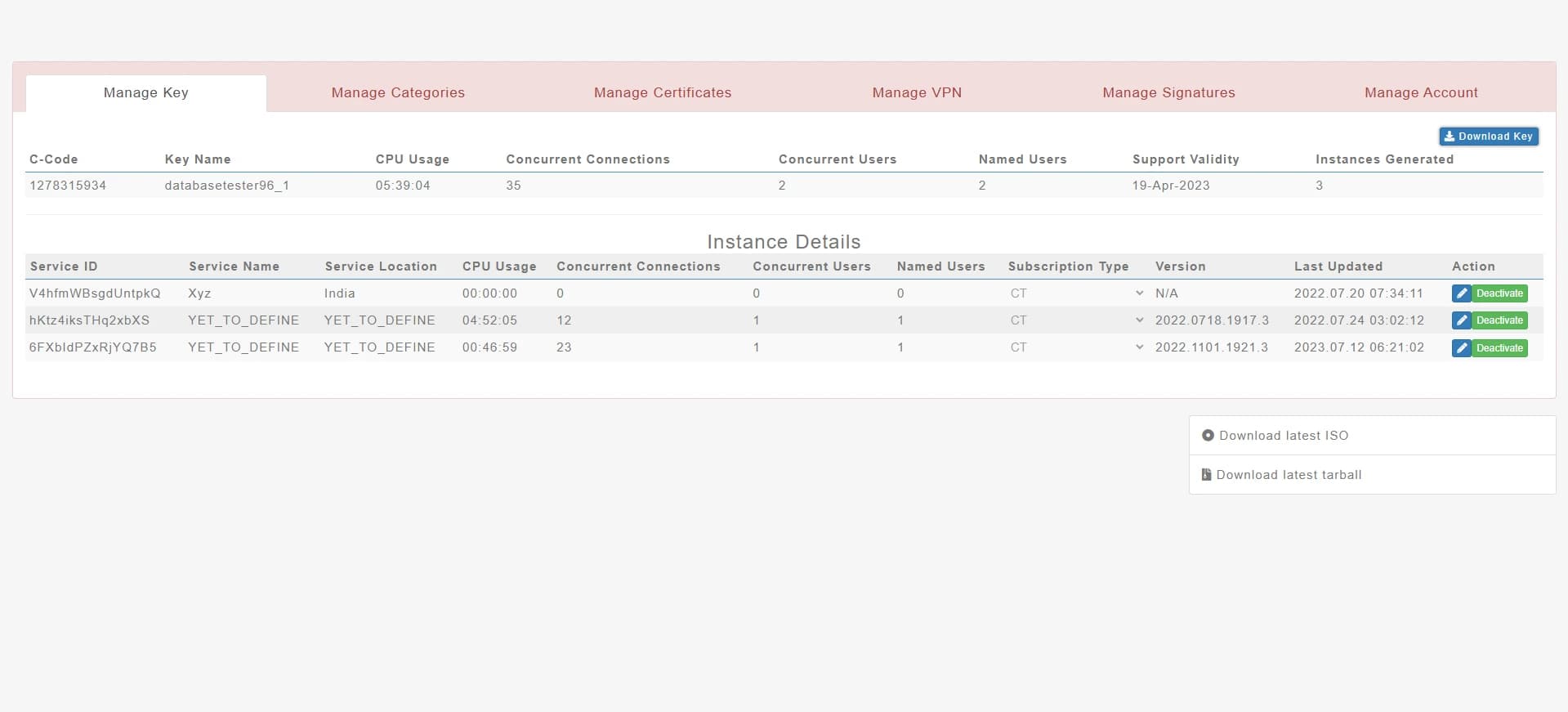
- Six tabs, no homeManage Key, Categories, Certificates, VPN, Signatures, Account. Every visit started in a table, and nothing said what needed attention.
- Expiry in column sevenSupport Validity sat between Named Users and Instances Generated: the most time-sensitive fact on the page, given the weight of a counter.
- Values without meaningCPU Usage reads 05:39:04, a duration where an admin expects load. One snapshot, with no trend and no threshold.
- Placeholders as namesInstances showed up as YET_TO_DEFINE, so admins told gateways apart by a 16-character Service ID.
- A destructive action styled as safeDeactivate is a green button beside Edit in every row. Green reads as go, and nothing asked for an OTP or recorded who pressed it.
- Setup outside any flowISO and tarball links float below the page. Sizing, installing and activating happened outside the portal, without guidance.
What one screen couldn’t show: the gaps
The audit covered what was on screen. Interviews surfaced what was missing entirely.
No clear home
No navigation model and no visible path to activation keys.
Not usable on smaller screens
Important actions broke down on tablet and mobile.
No live health
No performance plots for memory, connections, bandwidth or CPU.
No history
No trail of who changed what, or when.
No safety net
Critical, irreversible actions had no OTP confirmation.
Setup outside the portal
Instances and SSL certificates couldn’t be created in the portal at all.
Four roles, four very different days
The portal serves everyone in a customer’s organisation who touches SafeSquid. I mapped them by responsibility, and that map later became the permission model.
Super Admin
Owns the account and the team
If something goes wrong, it’s on me. I need to know who did what.
Needs
- Control over roles and access
- A safe way to hand over ownership
- A history of every change
Lives in
Admin
Runs day-to-day administration
I just want to find the right place quickly and get it done.
Needs
- One home that shows everything
- Search instead of hunting through tabs
- Create and edit patterns that stay consistent
Lives in
Technical Team
Deploys and monitors gateways
One wrong click can take a whole office offline.
Needs
- Live health beside every control
- Guided setup for instances and certificates
- Clear consequences before anything destructive
Lives in
Procurement Team
Handles subscription and renewals
Tell me before something expires, not after.
Needs
- Expiry dates up front
- Commercial details without technical clutter
- No access to controls they shouldn’t touch
Lives in
A survey, then interviews with the people running SafeSquid
I surveyed portal users about the tasks they ran most and where they got stuck, then interviewed customers’ admins and technicians to understand why.
Mobile mattered more than expected
The portal had been treated as a desktop tool, but customers wanted to act from their phones, especially during incidents.
Three themes, each turned into a principle
I grouped interview notes and survey answers into themes, then wrote one principle per theme to judge every later decision against.
Make the system observable
Users needed real-time performance plots, complete certificate details and a clear active or inactive status for every instance.
Principle: Keep operational state visible where decisions are made.
Secure administration
Teams asked for history, role-based permissions, clearer ownership and safeguards around important changes.
Principle: Attach identity, permission, confirmation and history to every high-risk action.
Move routine work into the portal
Instance setup, SSL creation, category management and mobile access depended on fragmented or missing paths.
Principle: Turn repeatable operations into guided self-service flows.
What success had to look like
Findable
A first-time user can locate every major area from one clear home.
Observable
Status and performance stay visible without opening separate tools.
Deliberate
Critical actions state their consequence and need role-aware confirmation.
Self-serve
Instance and certificate creation become guided, recoverable workflows.
Everywhere
Core management tasks work on desktop, tablet and mobile.
How might we…, then what stayed and what didn’t
I framed the themes as questions, ran ideation sessions with product and engineering, and sorted the ideas against the principles.
One place to start
How might we give every role one clear place to start, without a wall of menus?
Health where you act
How might we show an instance’s health right where people act on it?
Deliberate, not slow
How might we make irreversible actions deliberate without slowing everyday work?
Setup without support
How might we turn technical setup into something a new customer can finish alone?
Kept
7 ideas- Home overview with status and expiry on every area
- Search bar: “What would you like to do today?”
- Four-step instance builder with a progress rail
- Certificate branch: upload an enterprise CA or generate one
- OTP on destroy, deactivate, regenerate and ownership changes
- Activity history on every instance
- Team grouped by role, so permissions stay visible
Parked
- A dense sidebar listing every tool
- One long form for instance setup
- Plain “Are you sure?” dialogs
- A separate monitoring page, away from the controls
Six areas behind one home
I rebuilt the information architecture around jobs instead of the old tabs. Every area is reachable from the home, the search bar or the account menu, and each one holds its own creation, management and history, so nobody leaves an area to finish a task.
Three decisions, settled in low fidelity
Before any visual design, I compared the strongest options as wireframes and reviewed them with product and engineering.
How should people find their way around the portal?
78% struggled to find features. Leadership also wanted to avoid a dense sidebar, because newcomers already felt overwhelmed.
Trade-off accepted: Deep pages are one click further away, so the search bar became the shortcut for experienced admins.
How should instance setup work?
Creating an instance was one of the most requested features, but it involves technical decisions that can overwhelm a new customer.
Trade-off accepted: Experienced admins click through more steps; every step keeps its own Back, and nothing entered is lost.
How should destructive actions be confirmed?
70% were dissatisfied with security for important actions, and 75% wanted proper destroy and deactivate controls.
Trade-off accepted: An OTP adds a minute to a destructive action. That friction is deliberate, and it never touches everyday tasks.
Seven core tasks, walked step by step before and after
For each area I mapped the task as customers actually did it in the old portal, marked where it broke, then redesigned the flow around the decision the person was trying to make. Orange marks a friction point; blue is the redesigned path.
From six identical tabs to one question: “What would you like to do today?”
- Log in
- Land on Manage KeyA table, whatever you came to do
- Guess the tabSix “Manage” labels, no status
- Scan for the dateExpiry hidden in column seven
- Repeat in other tabsCertificate dates live elsewhere
- Log in
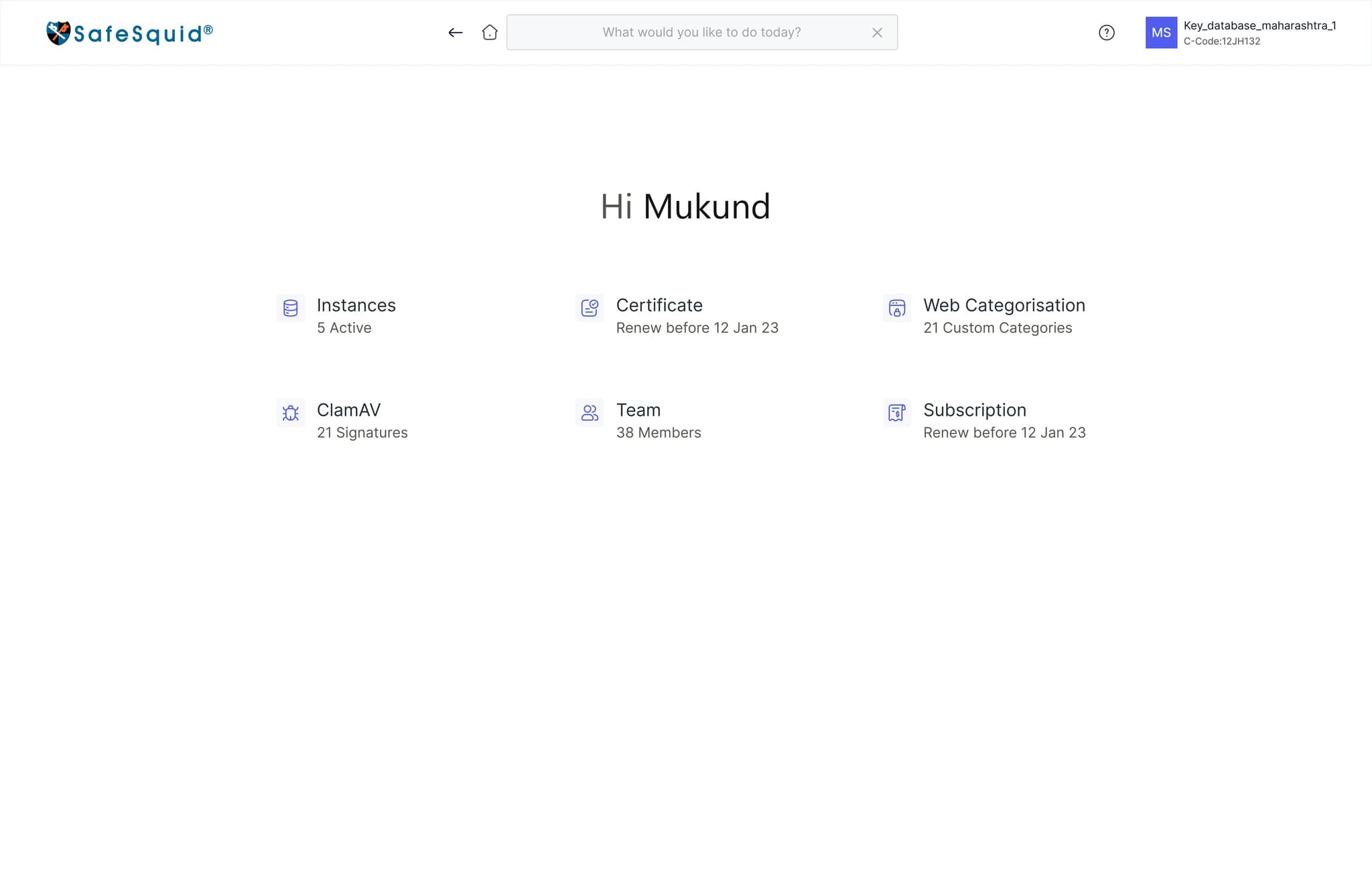
- Land on HomeSix areas, one status line each
- See what needs youExpiry turns amber, then red
- Open the area, or type the taskSearch reads like a question
- Why it broke
- The portal was organised around its database, not around jobs. Six “Manage” tabs looked identical, so a label never told anyone where their task lived, and no screen said what needed attention today.
- 78% struggled to find features or information
- What I designed
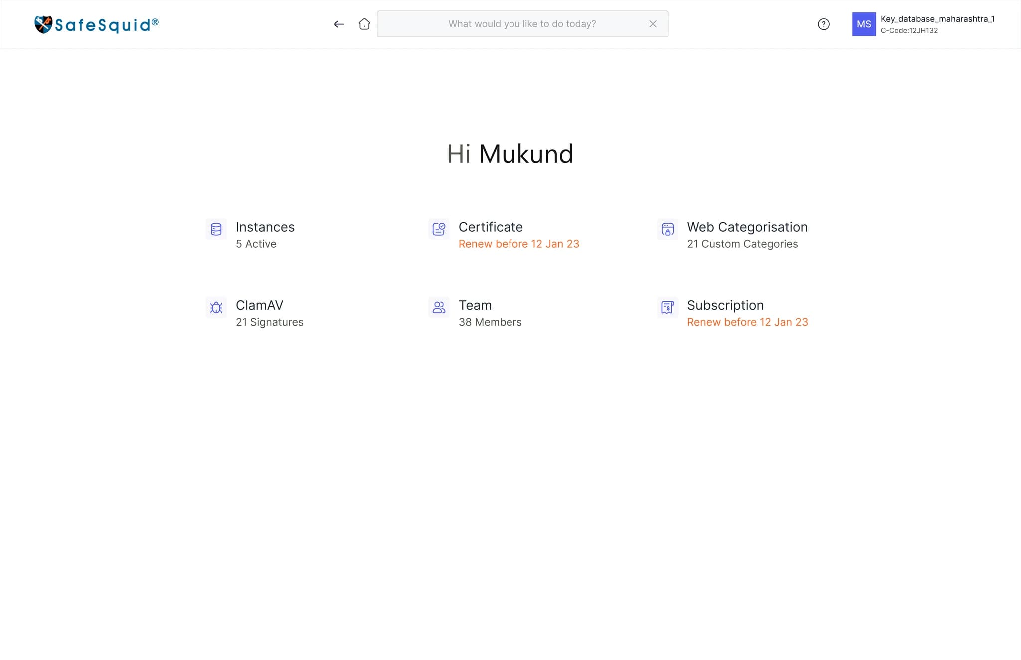
- A home of six areas, each with one status line: “5 Active”, “Renew before 12 Jan 23”, “38 Members”
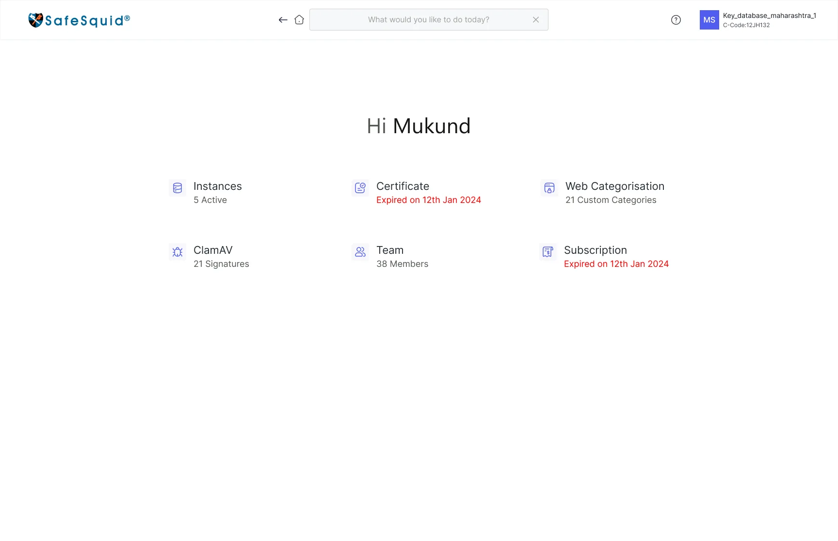
- Expiry that turns amber as renewal approaches and red once it has passed
- A task-worded search bar that also names the area you’re in
- Activation keys and the C-Code moved into the account menu, one click from anywhere
- Impact
- 2.5 → 4.5 / 5
- Navigation rating, asked with the same question as the original survey
Health and the controls, finally on the same page
- Open Manage Key
- Find the rowNames read YET_TO_DEFINE
- Read one snapshotCPU shown as 05:39:04
- Look elsewhere for trendsNo graphs in the portal
- Act from the table rowNo health beside the action
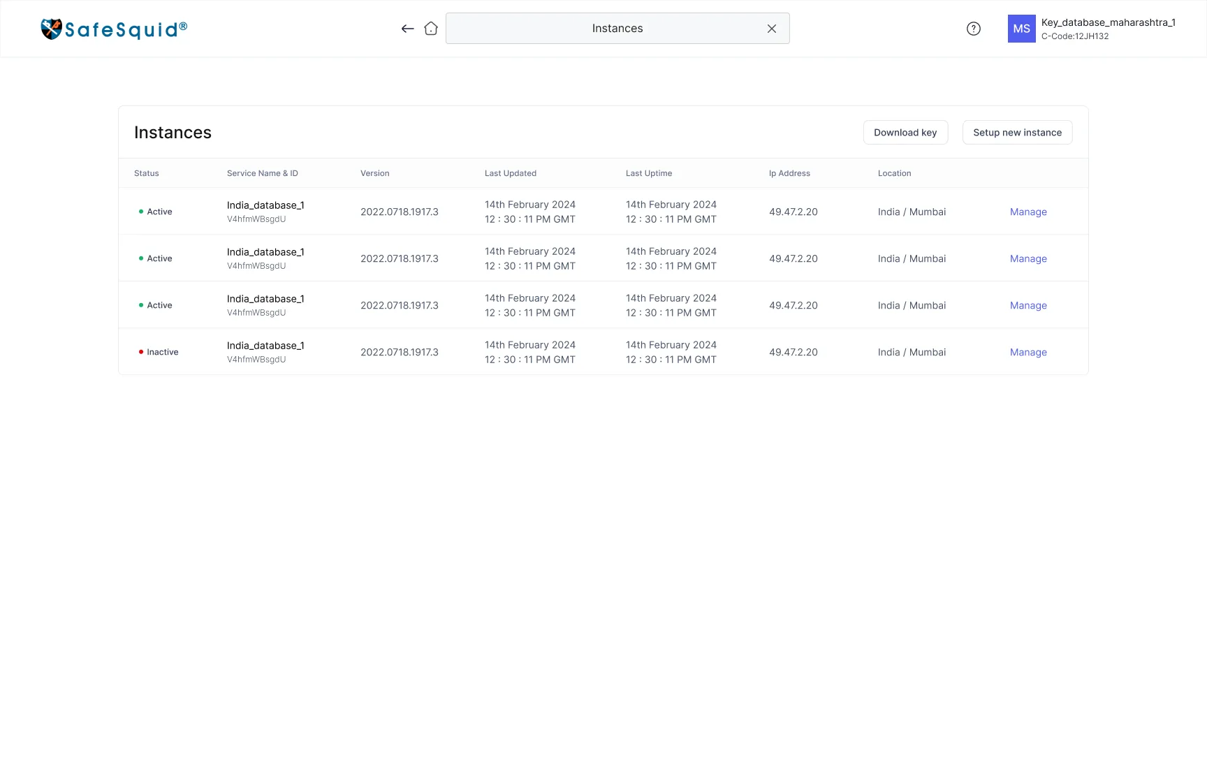
- Open InstancesActive or Inactive, in words and colour
- Pick by name and locationIndia_database_1 · Mumbai
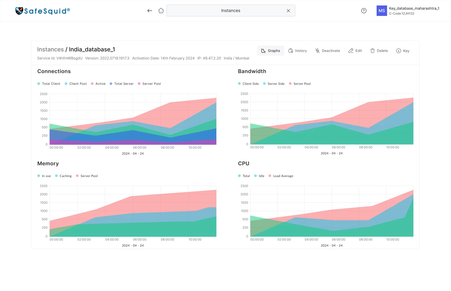
- Read the graphsConnections, bandwidth, memory, CPU
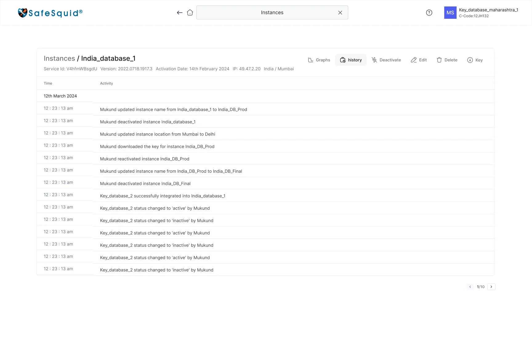
- Check the historyWho changed what, in sentences
- Act from the same headerEdit, deactivate, delete, key
- Why it broke
- Monitoring and management were split. An admin could see a number but not whether it was normal, then had to act from a table row with no health beside it.
- 82% called performance plots important or essential
- What I designed
- An instance list that leads with Active / Inactive in words and colour, then IP, version and location
- An instance page that opens on four graphs, each split into its pools: connections, bandwidth, memory and CPU
- History as a second tab on the same page, written in plain sentences and grouped by date
- Every action, from Edit to Delete, in one header above the evidence
- Impact
- 95%
- rated the new performance view very useful
Irreversible actions made deliberate, without slowing down everyday work
- Find the row
- Press the green DeactivateGreen reads as safe
- It’s doneNo OTP, no consequence stated
- Nobody knows who did itNo history to check
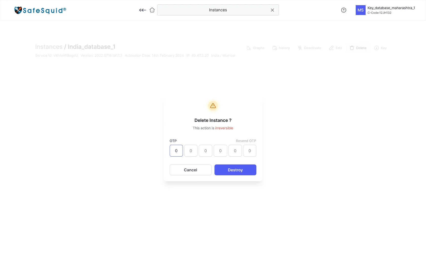
- Choose the actionFrom the instance header
- Read the consequence“This action is irreversible”, in red
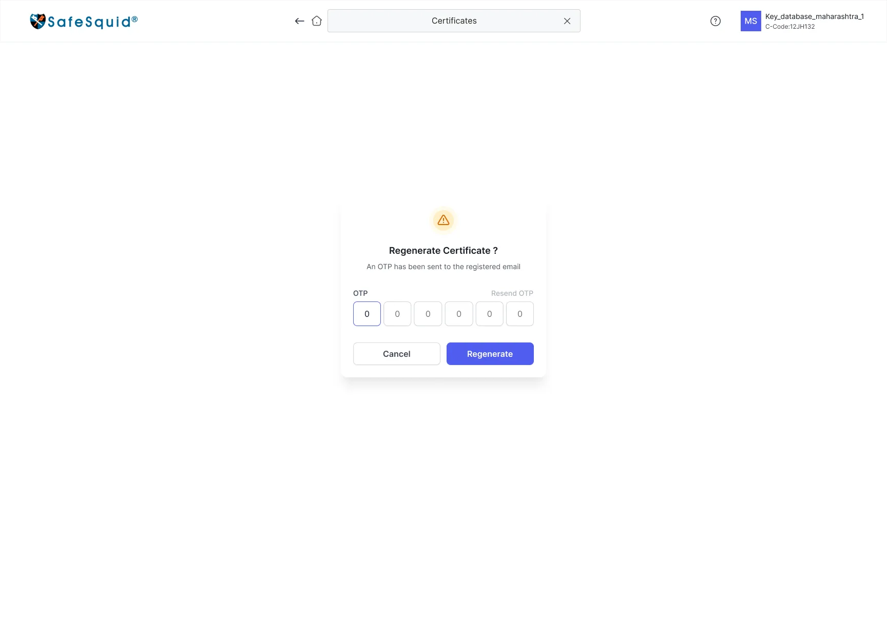
- Enter the OTPSent to the registered email
- ConfirmDestroy runs only with a valid code
- Leave a traceWritten to the instance history
- Why it broke
- The riskiest actions had the least friction. A green button beside Edit invited the same casual click as a rename, and the portal kept no record afterwards.
- 70% were dissatisfied with security for important actions
- What I designed
- Destructive actions moved out of table rows and into the instance header
- Consequence copy in plain words, with irreversibility called out in red
- An OTP to the registered email on destroy, deactivate, regenerate and ownership changes
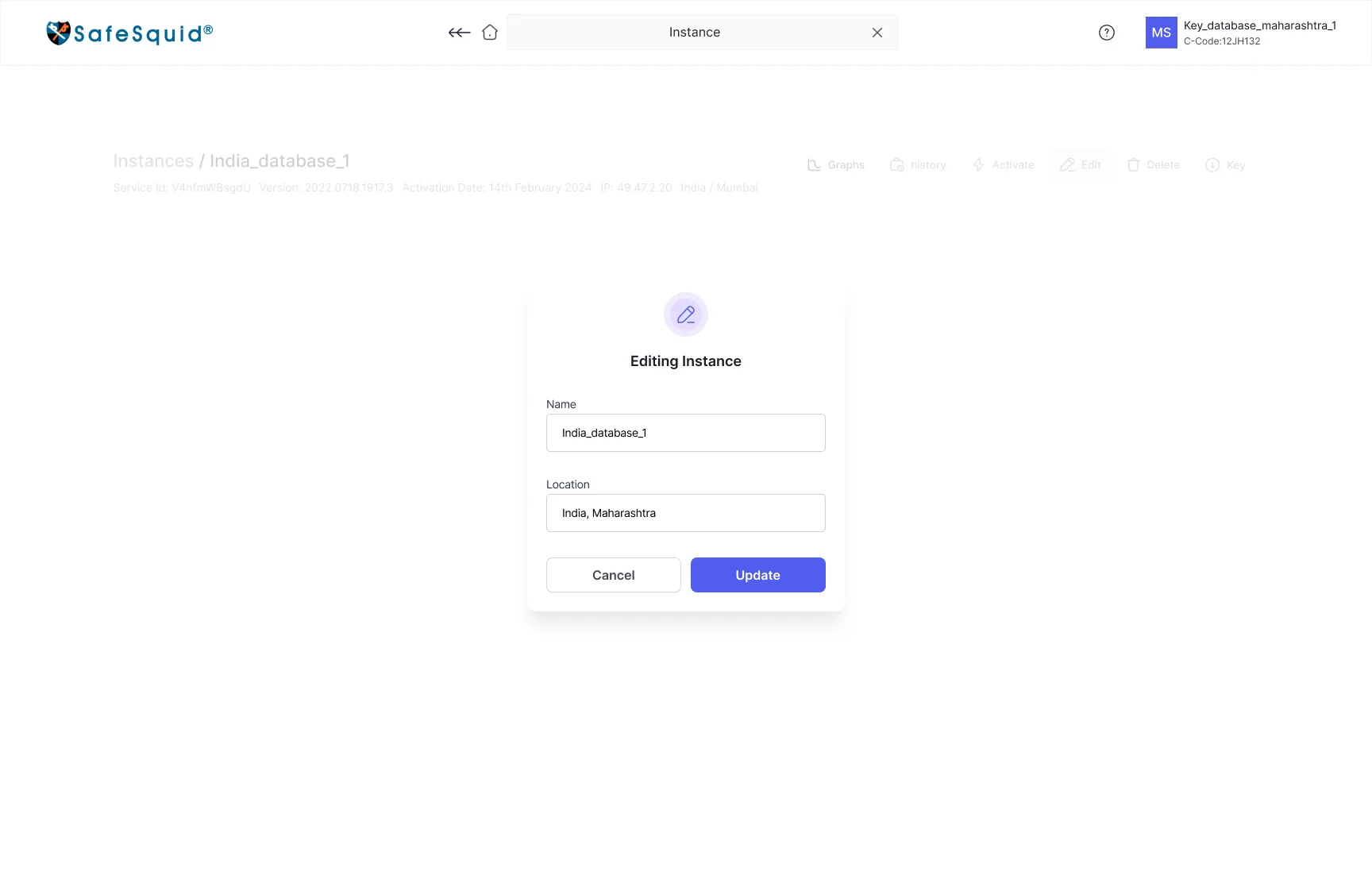
- Inline edits such as name and location left OTP-free, so friction stays where the risk is
- Impact
- −70%
- unauthorised attempts after OTP and history shipped
Setting up a gateway without leaving the portal
- Download the ISO or tarballTwo links, no guidance
- Size the hardware aloneNothing turns users into RAM
- Install outside the portal
- Come back for the keyDownload Key on Manage Key
- Activate by hand
- Choose deploymentAppliance, cloud template or tarball
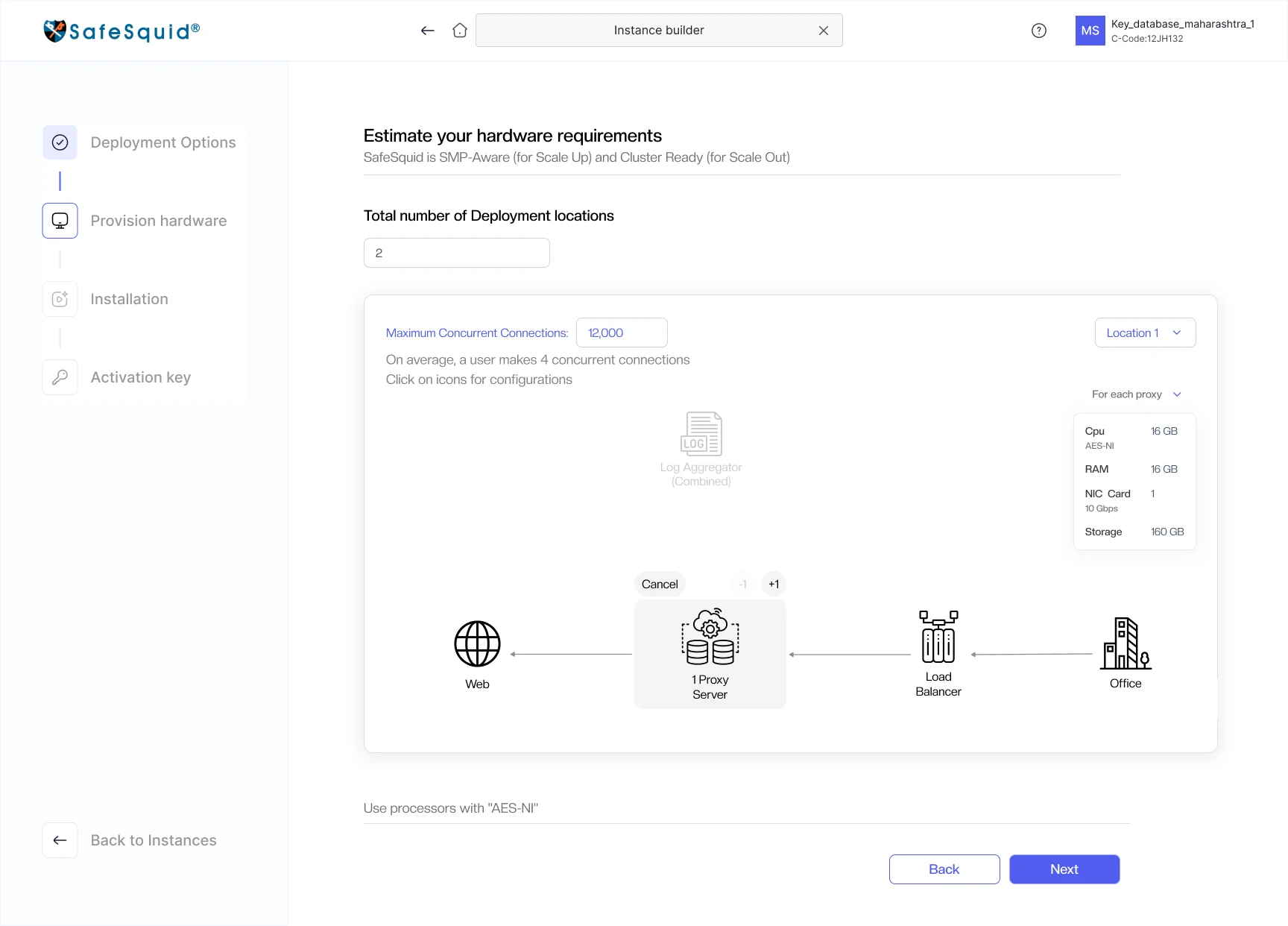
- Enter connections and locationsBuilder recommends the hardware
- Follow the install guideA short video for that route
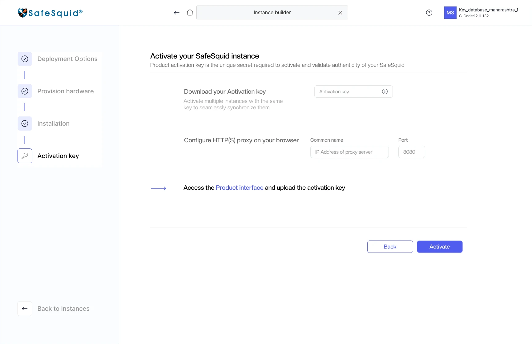
- ActivateDownload key, set proxy, upload key
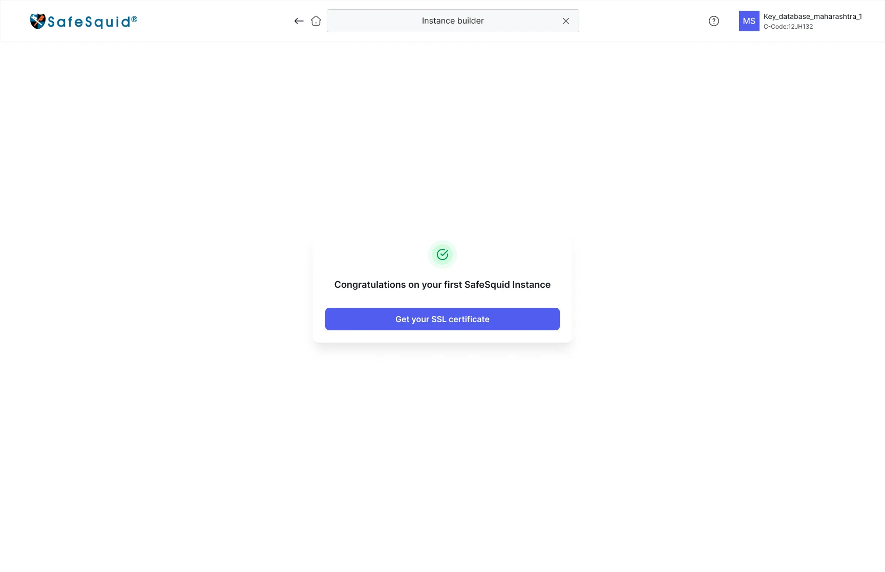
- Get a certificateSuccess leads straight on
- Why it broke
- The portal handed over files and stopped. The hardest decisions, which route and how big a machine, were made outside it with no guidance, so a self-serve product wasn’t self-serve at the moment it mattered most.
- What I designed
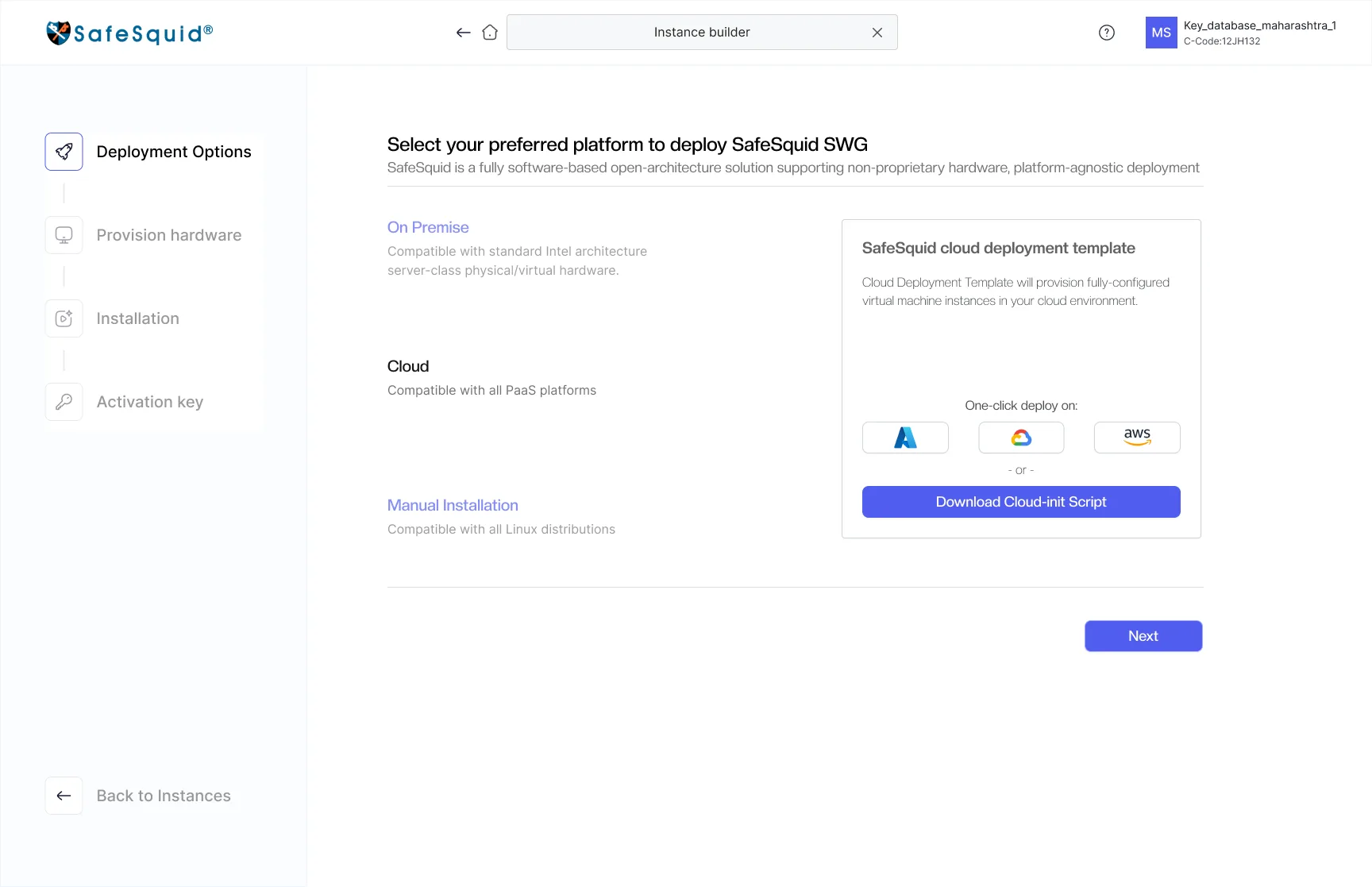
- A four-step builder with a progress rail: Deployment, Hardware, Installation, Activation key
- Three routes side by side: on-premise appliance, one-click AWS, Azure or GCP template, or a manual tarball
- Sizing asked in the customer’s terms: concurrent connections and locations, with the hint that a user makes about four connections
- A topology of Office → Load balancer → Proxy → Web, with the per-proxy spec beside it
- Back on every step, and Back to Instances always in view
- Impact
- In the portal
- Setup that happened outside the product is now one guided flow that ends at a certificate
One question first, then only the fields that apply
- Open Manage Certificates
- Find no way to create oneCreation wasn’t in the portal
- Create the CA elsewhereNo help with key type or subject
- Track expiry yourselfNo expiry state on any overview
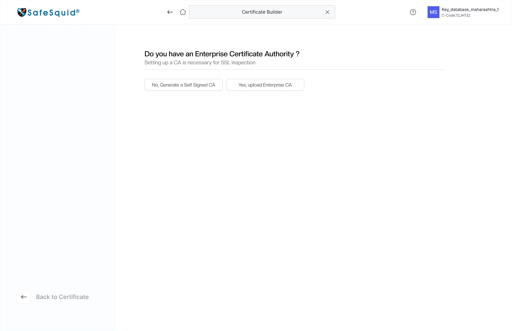
- Answer one question“Do you have an Enterprise CA?”
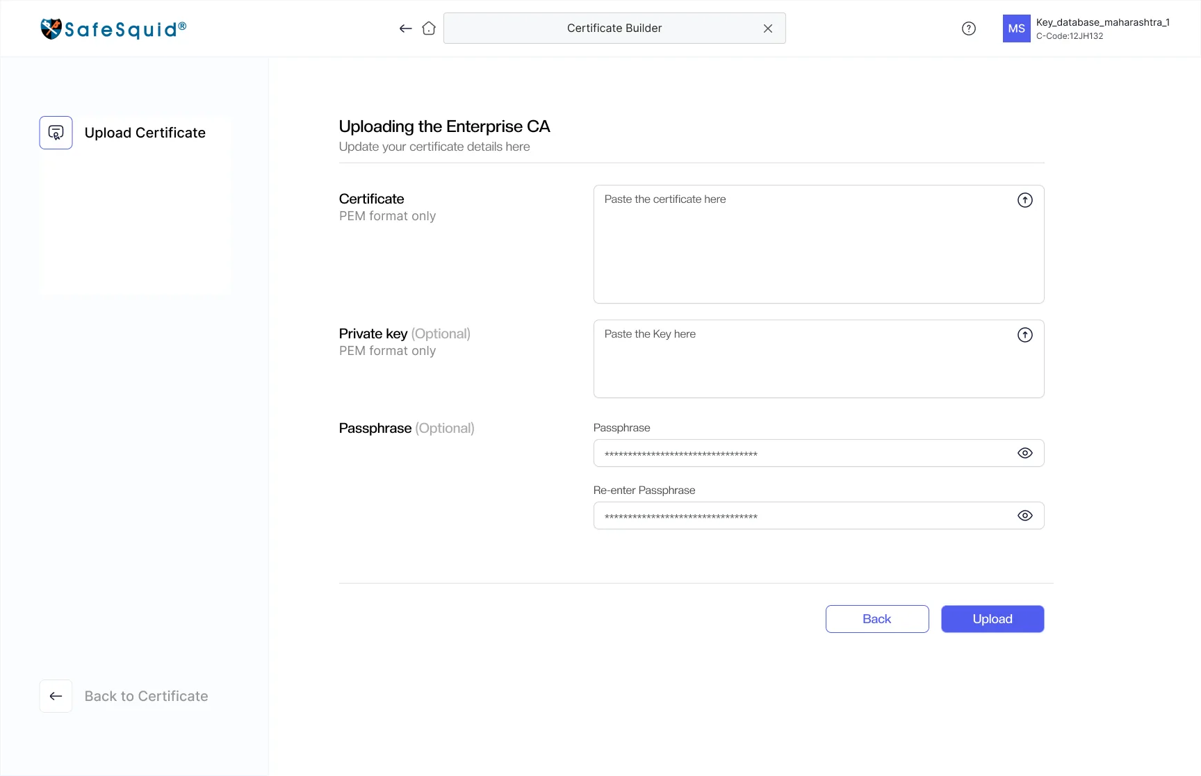
- Yes: upload itPEM, optional key and passphrase
- No: generate oneKey type, size and subject
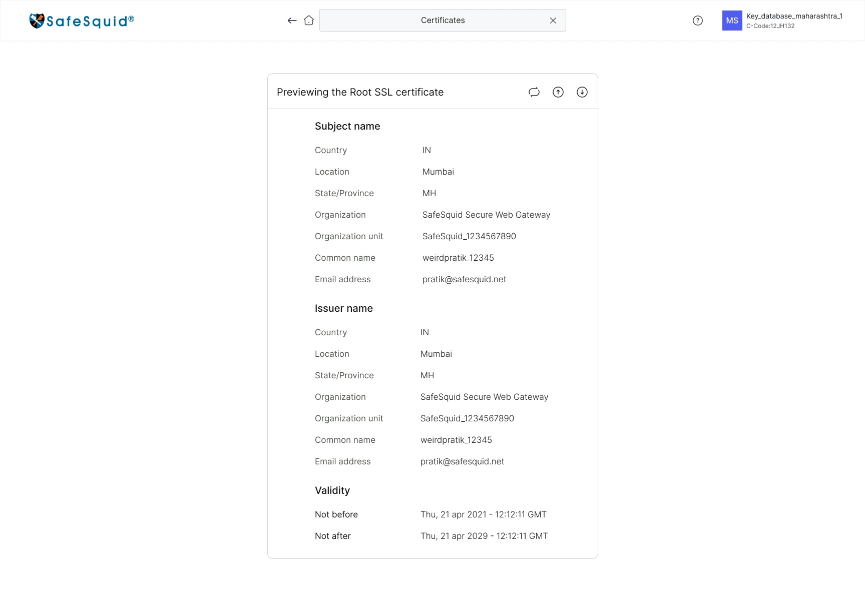
- PreviewSubject, issuer and validity
- Download or regenerateRegenerate needs an OTP
- Why it broke
- Two very different customers need a certificate: enterprises that already run a CA, and teams that don’t. One shared form would have shown each group fields that don’t apply to them.
- 60% wanted certificate creation on mobile
- What I designed
- A branching first question, so each path only shows its own fields
- Upload path: PEM certificate, with an optional private key and passphrase
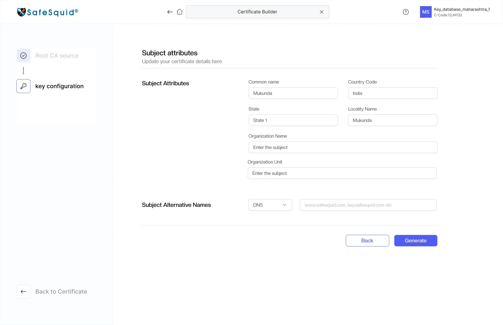
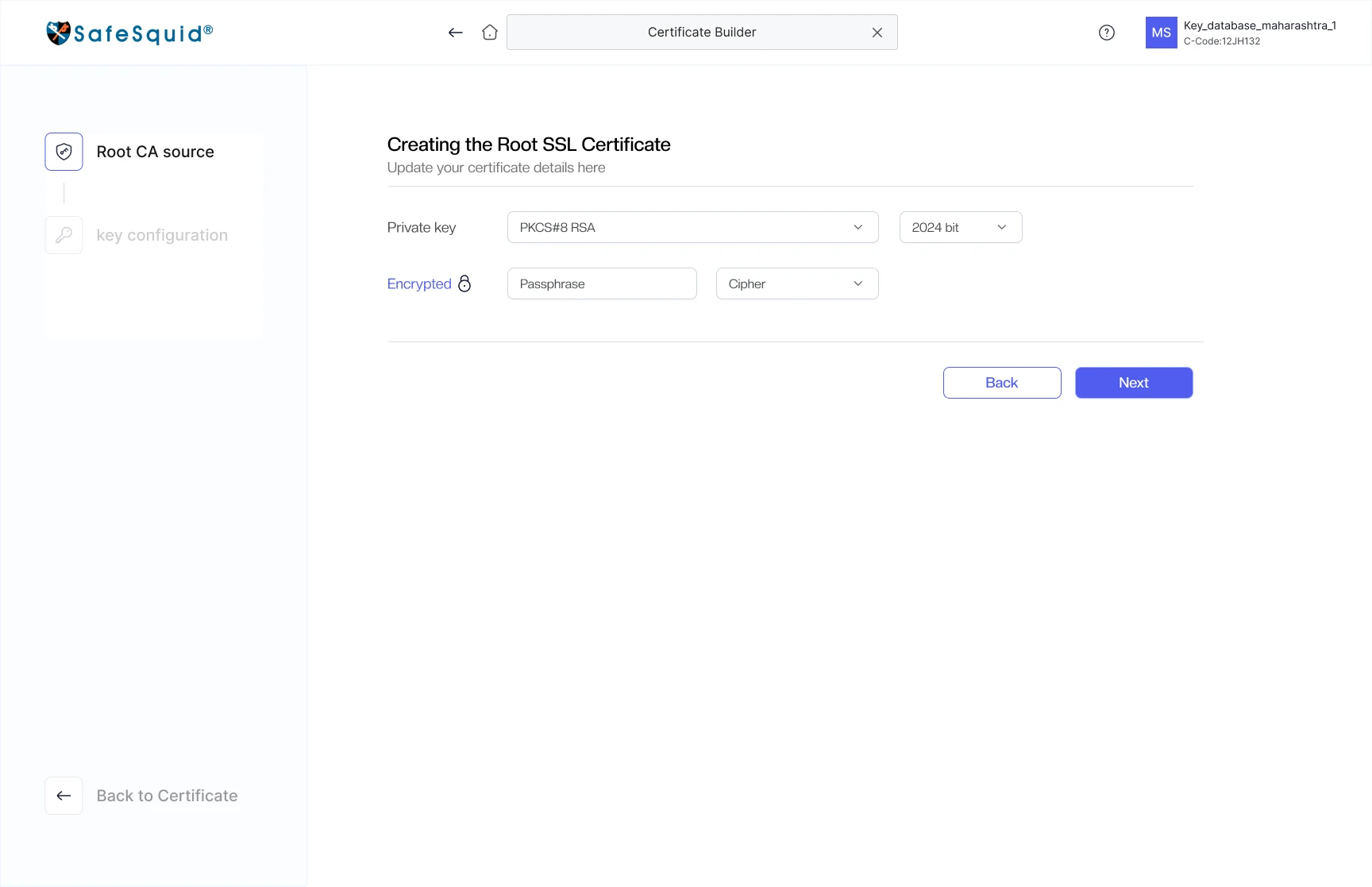
- Generate path: key type and size, optional encryption, then subject attributes
- A preview of subject, issuer and validity before download
- Certificate expiry on the home, amber then red
- Impact
- Self-serve
- Certificates are created in the portal, on any screen size, and their expiry is watched from the home
From a single URL lookup to a library people can see and maintain
- Open Manage Categories
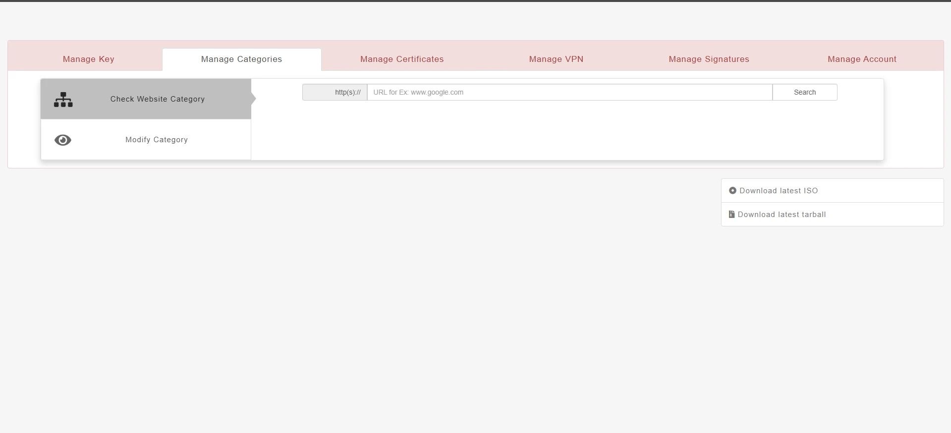
- Pick Check or ModifyTwo modes, one empty panel
- Type a URL to look it upNo view of existing categories
- Switch tabs for signaturesA different pattern again
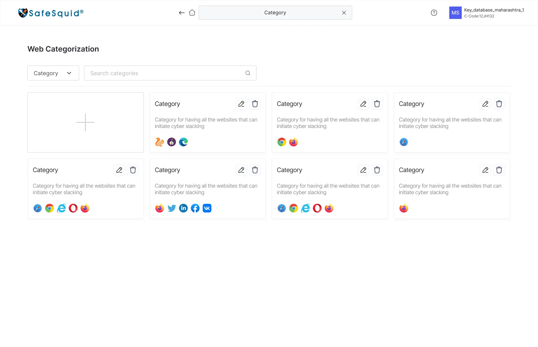
- Open Web CategorisationEvery category as a card
- Search or filter by type
- Recognise sites at a glanceFavicons on each card
- Create from the first cardErrors shown at the field
- Same pattern for signaturesLearn it once
- Why it broke
- Categories could be queried but never seen. An admin maintaining custom categories had no overview of what already existed, so the tool answered single questions instead of supporting upkeep.
- What I designed
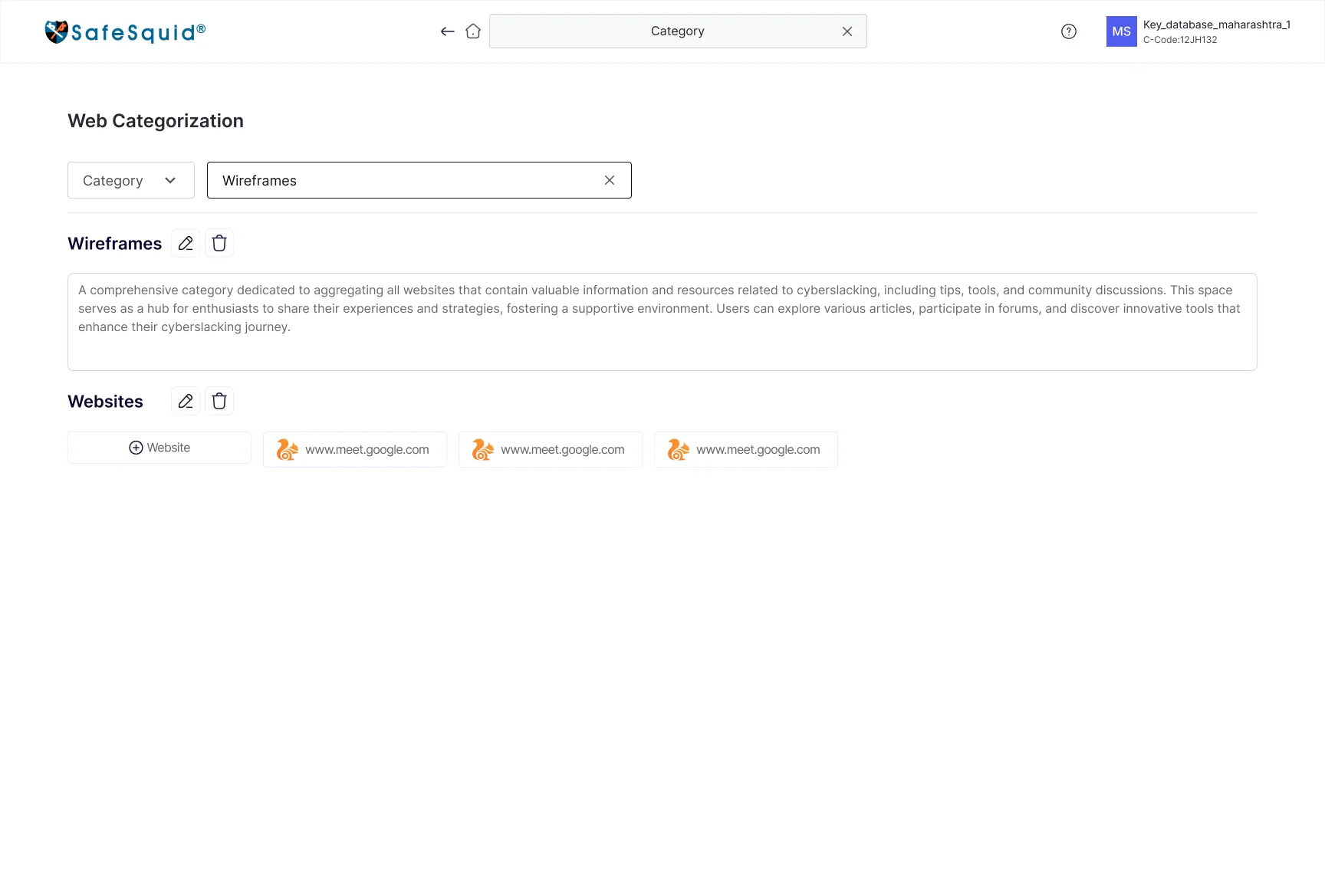
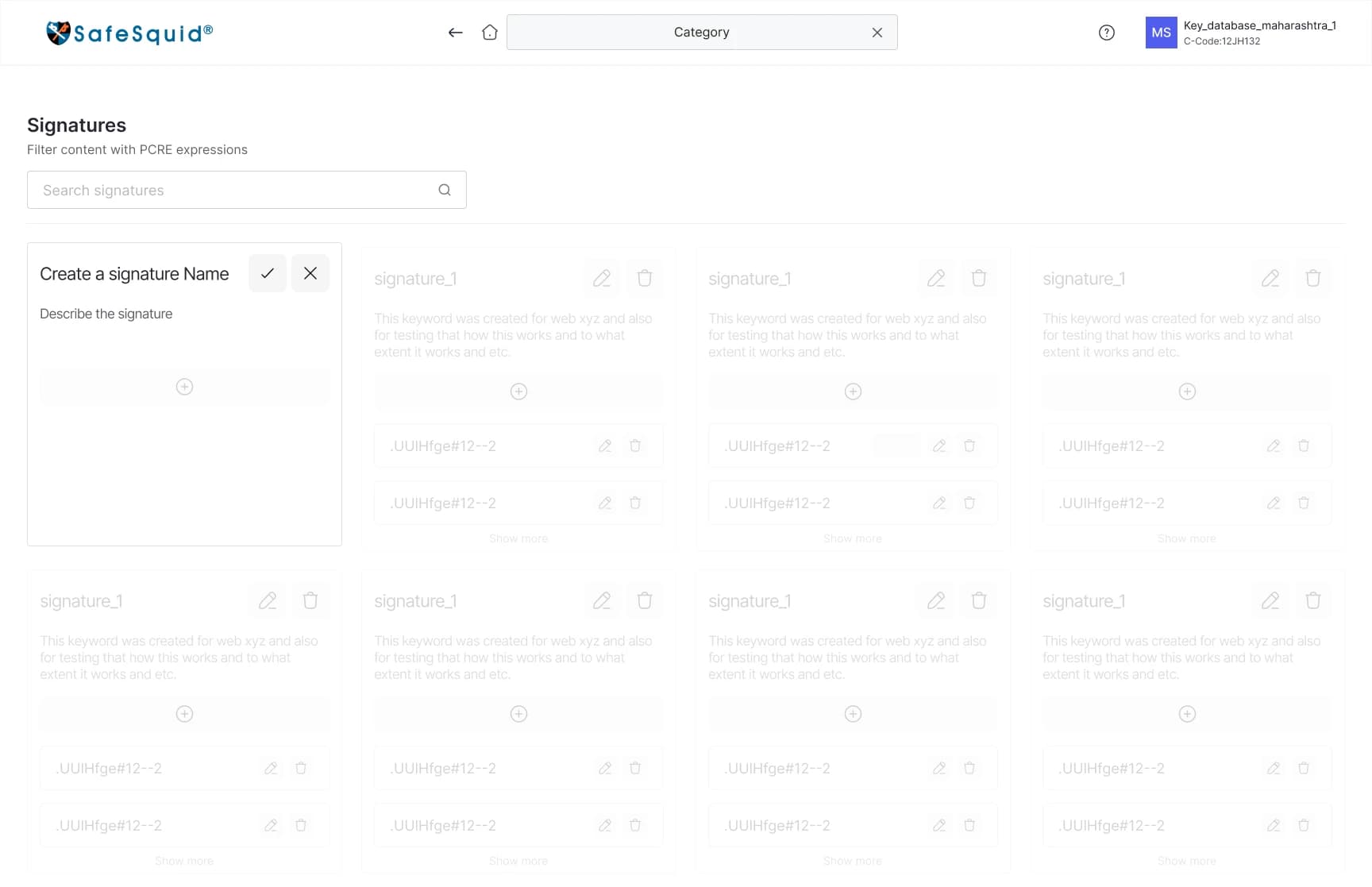
- A card grid showing each category’s name, purpose and member websites as favicons
- Search and a category-type filter at the top
- Create as the first card in the grid, so adding starts where browsing does
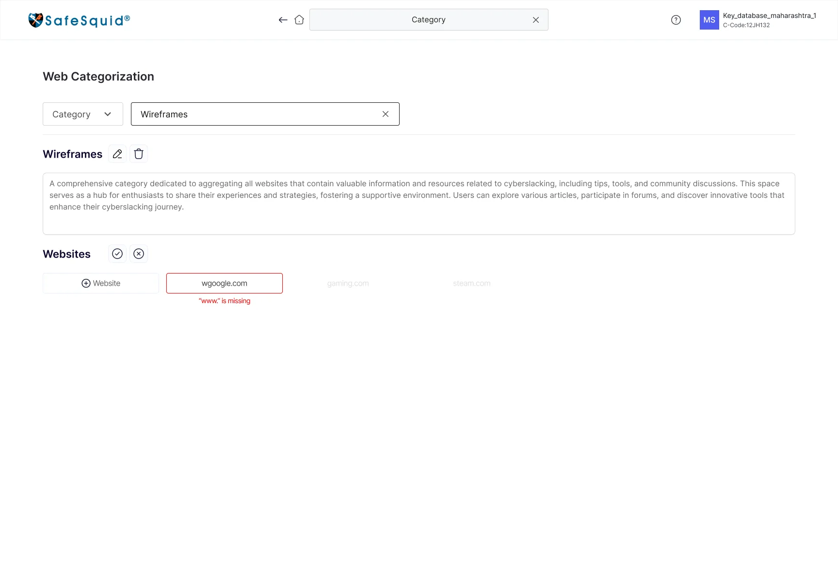
- Edit and delete on every card, with validation at the field
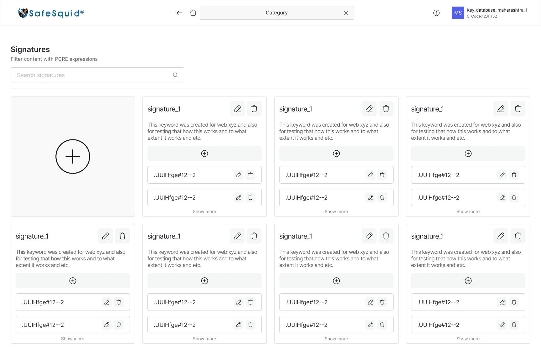
- ClamAV signatures on the identical create, search and edit pattern
- Impact
- 1 pattern
- Categories and signatures share one model, so learning one area teaches the other
Access you can read at a glance, and an owner who can’t disappear
- Open Manage Account
- Manage people without rolesNo role-based permissions
- Change accessNo trail of who changed what
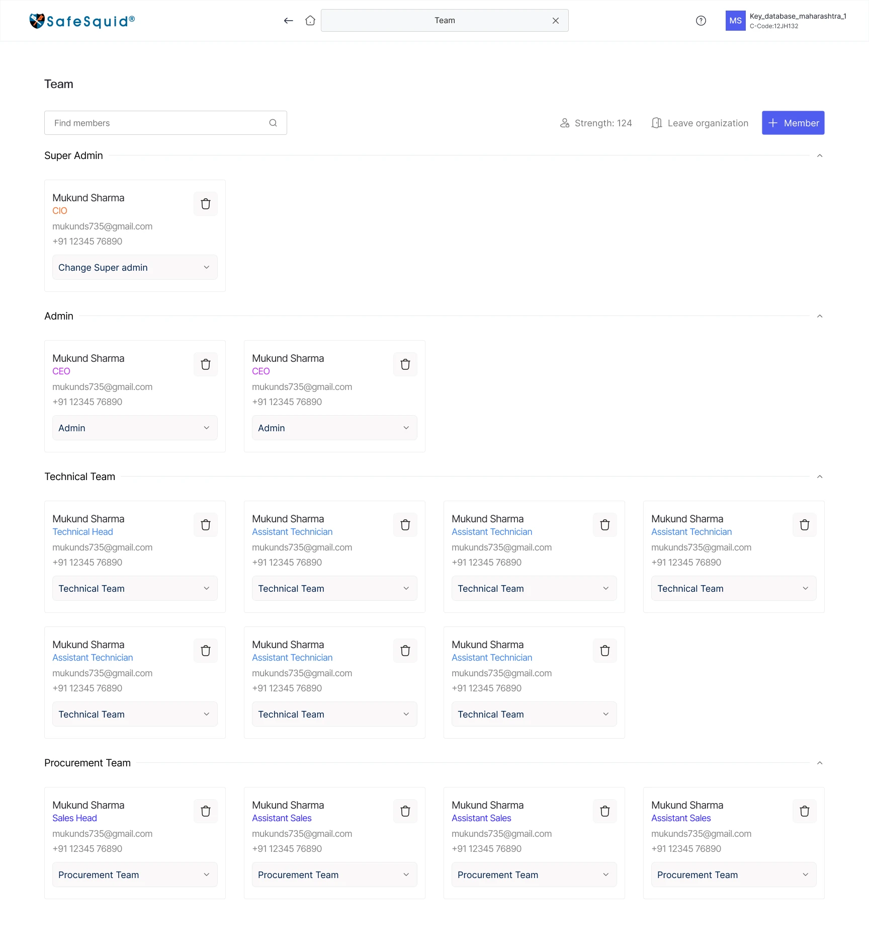
- Open TeamGrouped into four roles
- Find or add a memberSearch and + Member
- Change a role in placeDropdown on each card
- Transfer Super AdminOnly with an OTP
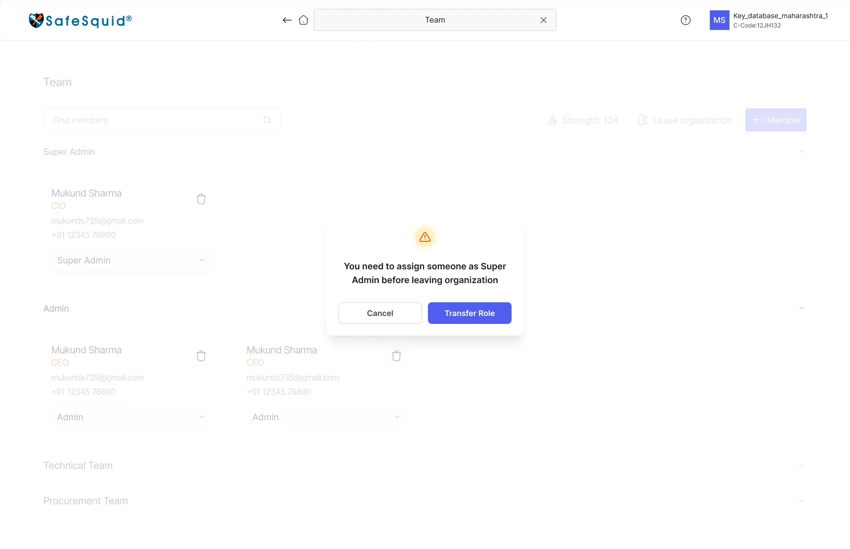
- Leave safelyName a successor first
- Why it broke
- Security teams ask one question of an access screen: who can do what? A flat list can’t answer it, and an account whose only owner leaves is locked out of its own gateways.
- 90% said a history would improve accountability
- What I designed
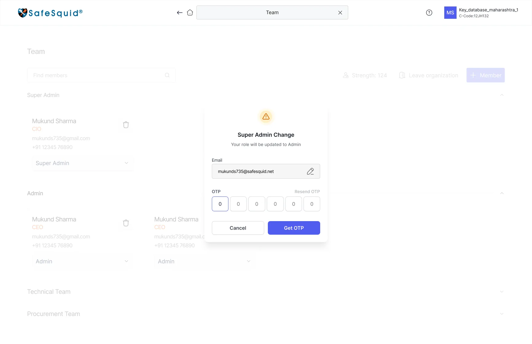
- Four roles taken straight from the research personas, each a collapsible section
- Role changes from a dropdown on the member’s own card
- Super Admin transfer behind an OTP
- A guard that stops the last Super Admin leaving without naming a successor
- Impact
- 4 roles
- Permissions matched to responsibility, and ownership that always has a named holder
The calls that shaped the portal, and what each one cost
Every decision had a cheaper or more familiar alternative. These are the eight that mattered most: the options I weighed, why one won, and the trade-off I accepted to get it.
- Decision 01
Each home tile carries one status line, not a chart
- The question
- What should four very different roles see first when they open the portal?
- Options I weighed
- Why this one
- The home has one job: tell each role whether an area needs them today. One line of state answers that for all four roles, and colour escalates only when a date is close or has passed.
- Trade-off I accepted
- No graphs on the home. Telemetry is one click away, on the instance itself, where it can be acted on.
- How I knew
- Testing task 1, “find when your SSL certificate expires and renew it”, starts on this screen.
- Decision 02
The search bar doubles as “you are here”
- The question
- Without a sidebar, how does someone know where they are, and get anywhere fast?
- Options I weighed
- Why this one
- One element answers both questions. Experienced admins type and jump; newcomers read the bar to know where they are. Back and Home sit right beside it.
- Trade-off I accepted
- The bar only names the area, so deeper pages add their own trail, such as Instances / India_database_1.
- Decision 03
Graphs first, with every action above them
- The question
- Where should an admin decide whether to touch an instance?
- Options I weighed
- Why this one
- People check health before they act, and the expensive mistake is acting on the wrong instance. Opening on the graphs puts evidence in front of every action.
- Trade-off I accepted
- The list shows status only; reading trends takes one click into the instance.
- How I knew
- 95% rated the new performance view very useful.
- Decision 04
Friction only where the risk is
- The question
- How much confirmation should each action carry?
- Options I weighed
- Why this one
- “Are you sure?” fails because it looks the same for a rename and a destroy. Tying the OTP to irreversibility keeps it rare enough to be read every time.
- Trade-off I accepted
- A destructive action takes about a minute longer. That’s deliberate, and it never touches everyday tasks.
- How I knew
- Unauthorised attempts fell by 70% once OTP and history shipped.
- Decision 05
The instance limit becomes a choice, not an error
- The question
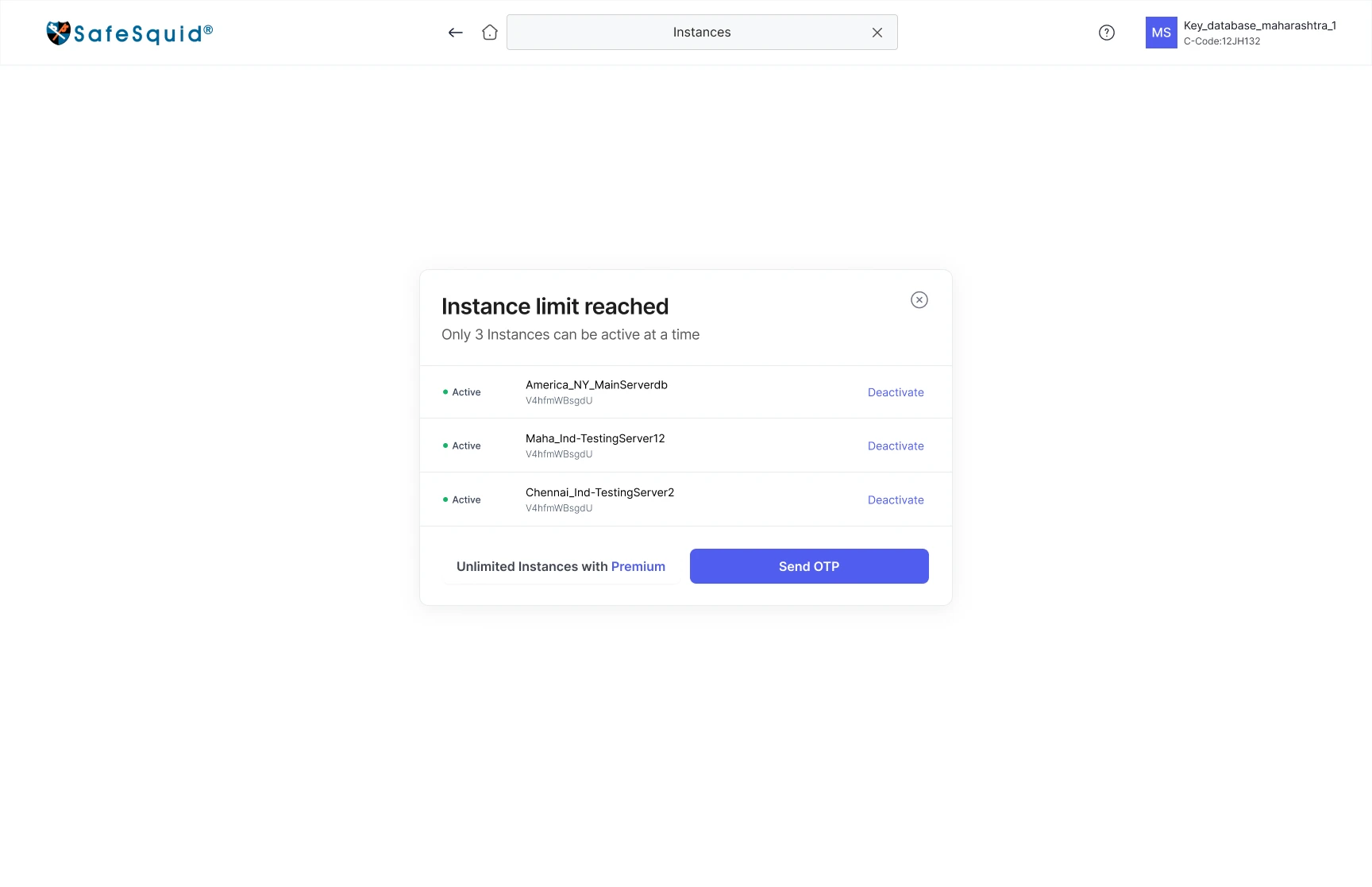
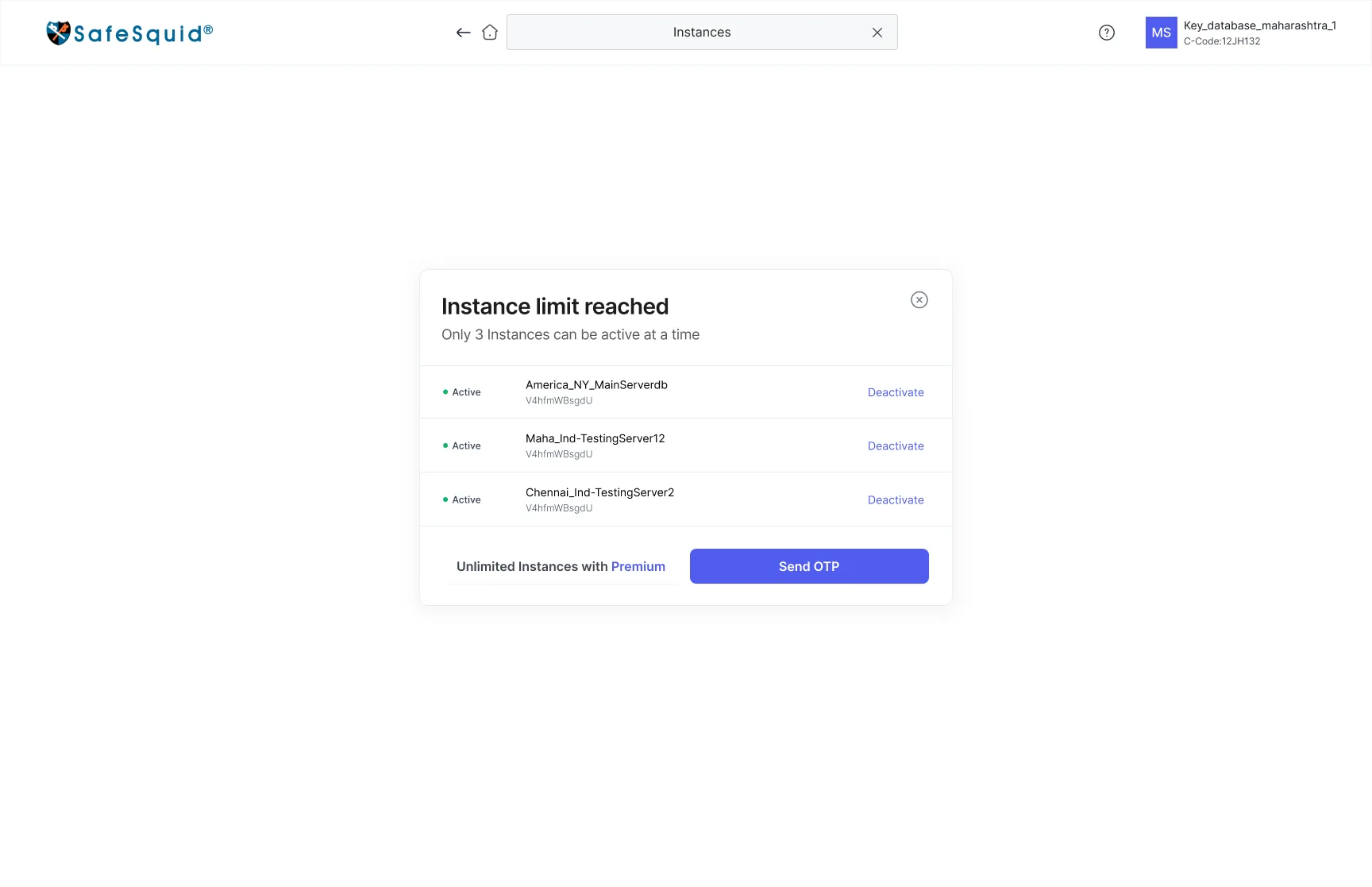
- What happens when a customer activates one instance more than their plan allows?
- Options I weighed
- Why this one
- The customer came to run a new instance. The dialog explains the rule, only three instances can be active at a time, and offers the fastest legitimate path to their goal.
- Trade-off I accepted
- The upgrade is quieter than a sales-led wall would make it. It still sits in the dialog, at the exact moment the limit is felt.
- Decision 06
Ask for sizing in the customer’s terms
- The question
- How do you get a correct hardware spec from someone who knows their offices, not their RAM?
- Options I weighed
- Why this one
- Customers know their headcount and their offices. The builder turns that into CPU, RAM, NIC and storage per proxy and draws the topology, so the recommendation is visible and checkable.
- Trade-off I accepted
- The spec is an estimate built on averages. Showing it per proxy, beside the diagram, lets a technician sanity-check it before buying hardware.
- Decision 07
Activity history written as sentences
- The question
- Who reads the history, and what are they trying to find out?
- Options I weighed
- Why this one
- The Super Admin reads history to answer who did what, and when, usually after something has gone wrong. A sentence answers that without decoding.
- Trade-off I accepted
- Sentences are slower to scan by column, so entries are grouped by date and paginated.
- Decision 08
The team grouped by role, not by name
- The question
- How should a large team be shown so that permissions stay visible?
- Options I weighed
- Why this one
- Access questions are role questions. Grouping turns the answer into the layout itself, and the roles are the same four people from the research.
- Trade-off I accepted
- Large teams make long pages, so each section collapses and a member search sits at the top.
Every area, screen by screen
Each area follows the same rules: status where you act, one clear primary action, and a deliberate step before anything irreversible.
A home that makes the next task visible
Six areas share one starting point. Expiry turns amber as renewal approaches and red once it has passed, so a time-sensitive issue is visible without interrupting other work.
Keys and account, one menu away
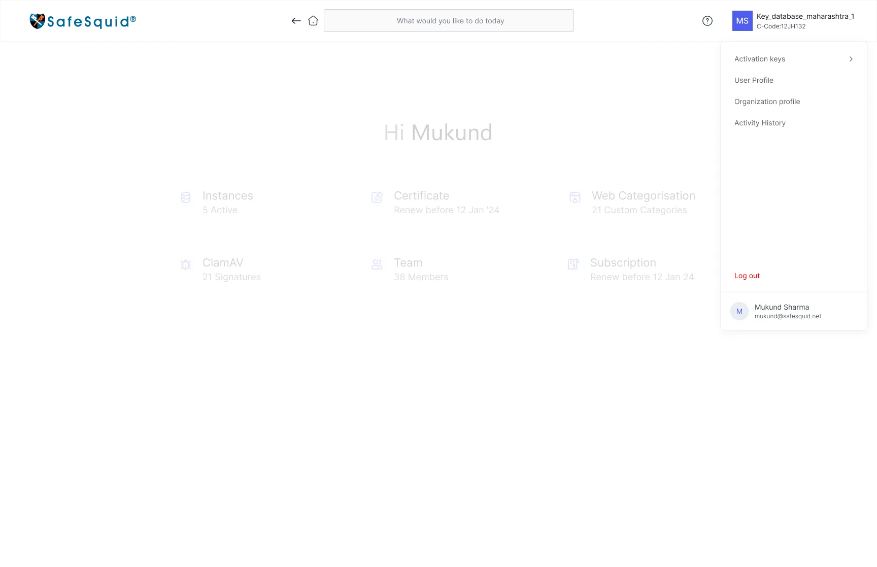
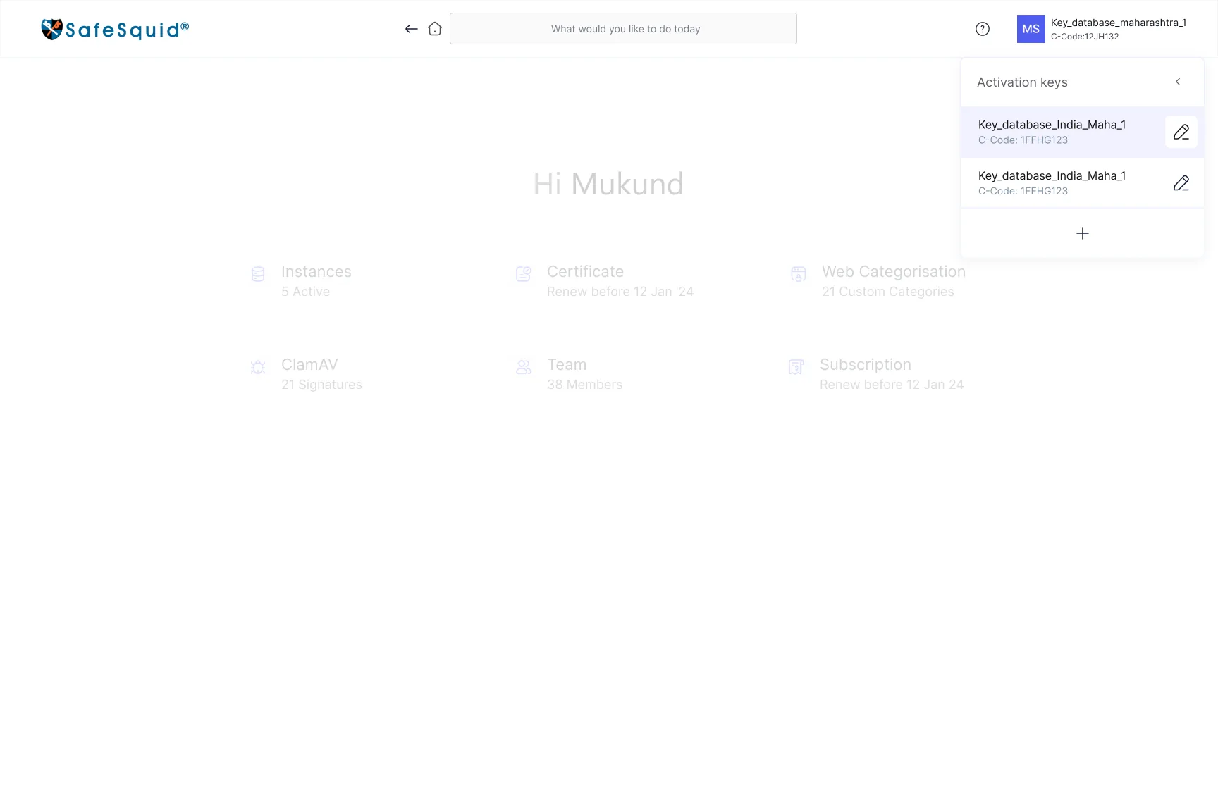
The account menu holds activation keys, profiles and activity history. Keys can be renamed inline, and the C-Code stays visible for support calls.
Instance builder: setup in four steps
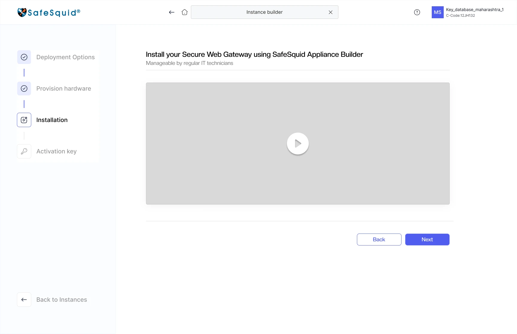
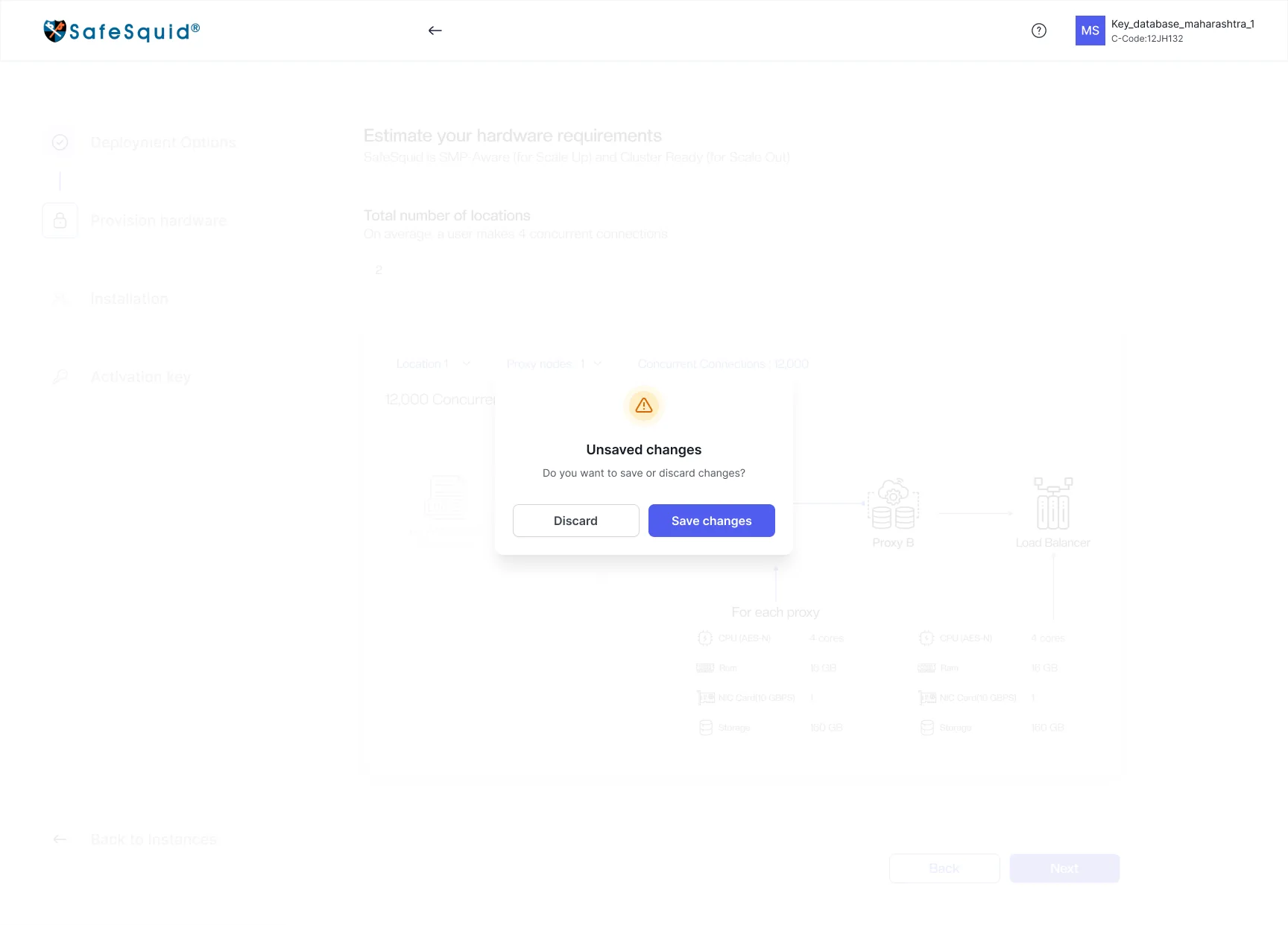
Deployment, hardware, installation and activation, with a progress rail and Back on every step. The hardware step recommends CPU, RAM and storage from expected connections.
Instances: check health, then act in the same place
Status, IP and version sit beside the management actions. Graphs for connections, bandwidth, memory and CPU, and a full history, live on the instance itself.
Certificates: only the fields that apply
The builder asks one question first, then branches. The preview shows subject, issuer and validity, with download, regenerate and upload one click away.
Web categories and signatures: one pattern for both
Categories and ClamAV signatures share the same create, search and edit pattern, so learning one teaches the other.
Team: access matched to responsibility
Members are grouped by role. Ownership can only change hands with an OTP, and a Super Admin can’t leave without naming a successor.
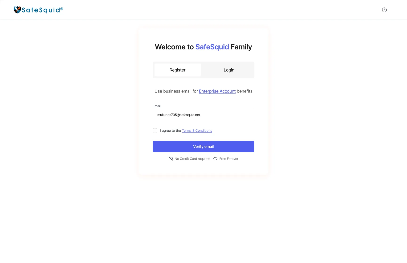
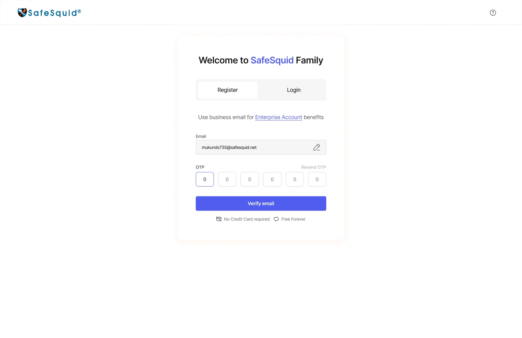
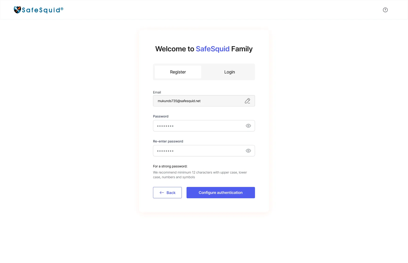
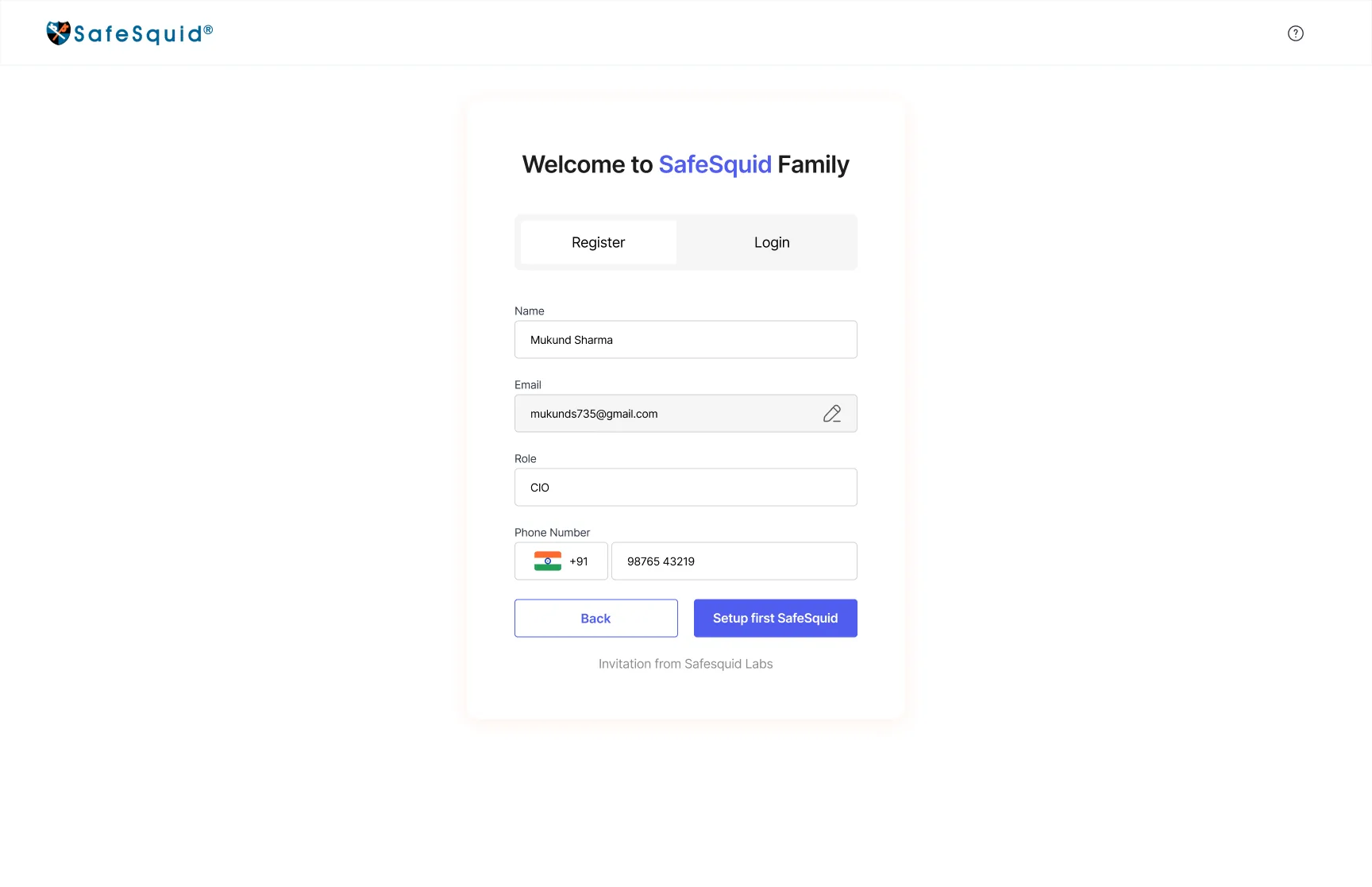
Sign-up in four short steps
Business email, OTP, a strong password and a short profile. Each step is one card, with errors shown at the field.
Designing for the moments that go wrong
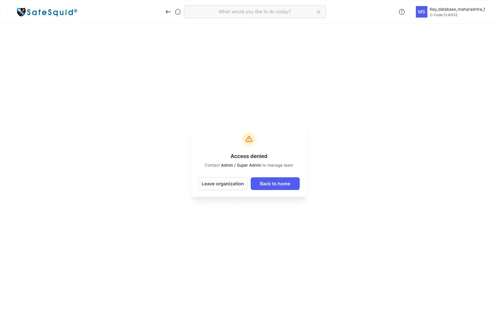
A security portal is judged on its edge cases. Every flow has its error, empty, limit and confirmation states designed, not left to engineering.
Accessibility and responsive rules
Status in words
Status uses written labels alongside colour, so meaning never depends on colour alone.
Explicit verbs
Critical actions use clear verbs and consequence copy instead of ambiguous icons.
Same hierarchy, any screen
Responsive layouts keep the task hierarchy instead of hiding core actions on smaller screens.
Guidance in the form
Search, section labels, field guidance and validation keep navigation and forms understandable.
Task-based sessions on the prototype
I tested a clickable prototype with customers’ sysadmins and SafeSquid’s engineering team. Each session covered the same six tasks, and ended with the navigation question from the original survey so the scores could be compared.
Task 1 · Home, expiry state, certificates
Find when your SSL certificate expires, and renew it.
Task 2 · Instance builder
Set up a new instance on the cloud provider you use.
Task 3 · Instance graphs
Check which instance is using the most memory right now.
Task 4 · Consequence copy, OTP
Deactivate an instance you no longer need.
Task 5 · Team, ownership transfer
Hand over Super Admin to a colleague before you leave.
Task 6 · Web categorisation
Create a custom web category and add two websites to it.
Clearer, safer and finally self-serve
After the redesign, customers rated navigation far higher, valued the live monitoring, and the history and OTP safeguards cut unauthorised attempts.
Key Learnings
Show complexity, don’t hide it
Admins wanted dense, readable telemetry beside the controls. Clarity came from grouping and hierarchy, not from removing information.
Security belongs inside the interaction
OTP, consequence copy and history work because they sit in the flow itself, not in a policy people are expected to remember.
Guided doesn’t mean dumbed down
The builders break setup into steps, but every step still shows the values an experienced admin needs.
Website Tester
Desktop diagnostic & network inspection workspace.